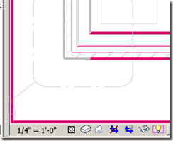
Revit comes with a lot of visual clues to represent various modes. For eg., the reveal hidden elements mode is shown like
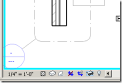
The temporary hide / isolate mode is like
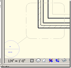
Group edit mode is like
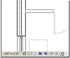
However, Design option edit more just grey out the objects that don't belong in the design option.
Since greying out (screening out) of objects are used in architectural drawing to denote phases, existing condition, etc., a better visual clue with a border like temp hide / reveal hidden will help a lot. It will be even better if the border came up with a name of the design option being edited.
Revit help says:
To determine whether you are currently in Design Option Edit mode, check the Editing button of the Design Options toolbar. If it appears to be pressed (instead of raised), you are in Design Option Edit mode.....To determine which design option is currently active for editing, move the mouse over the Editing button. It displays a tooltip that indicates the active option, using the following format
I wish there was a better clue.


1 comment:
Good point
Post a Comment